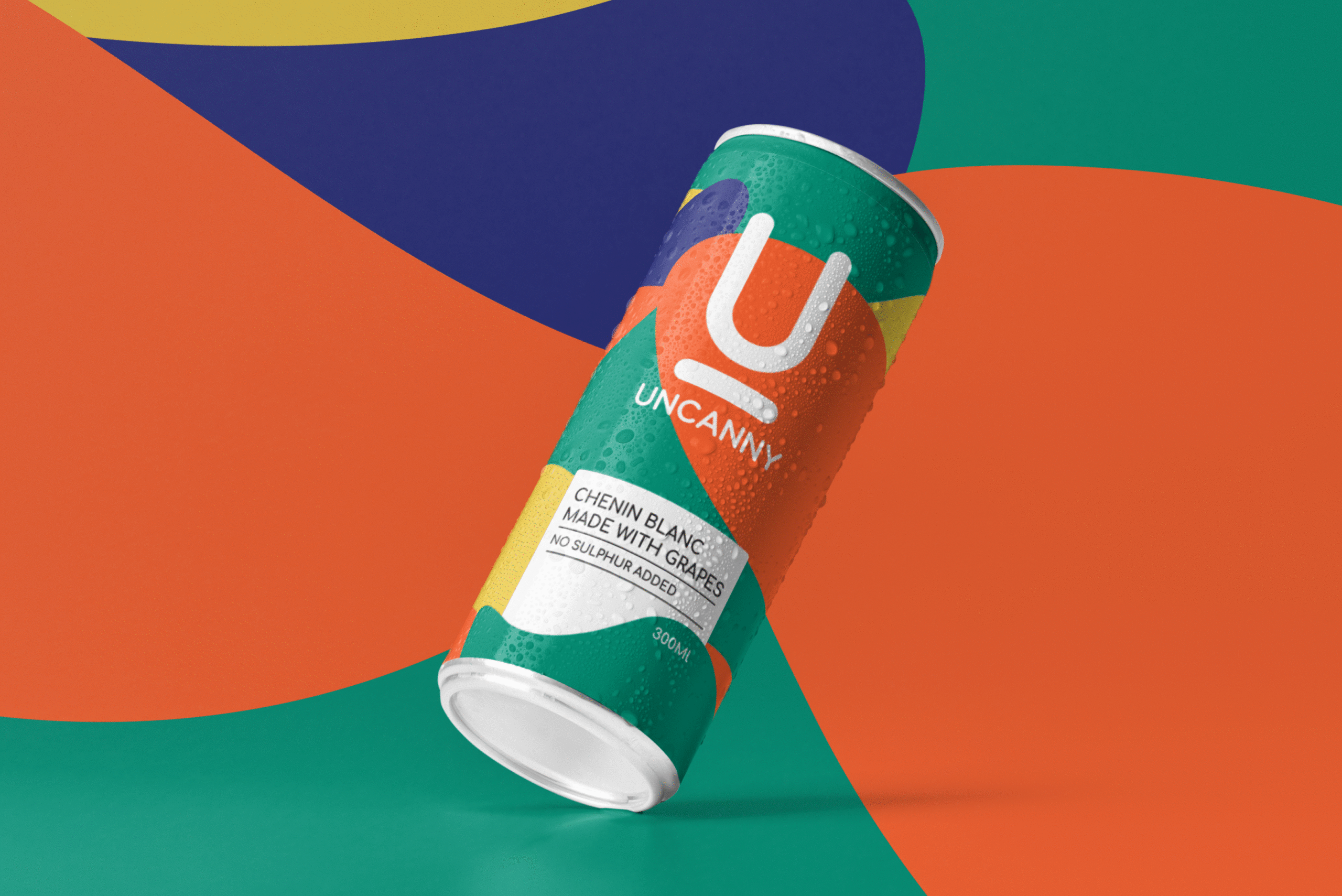
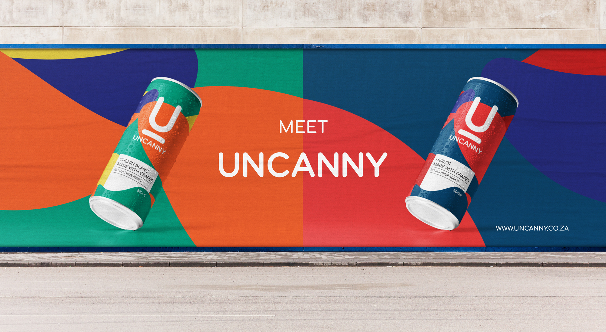
The brief Uncanny marked South Africa’s introduction to premium canned wine. It was a unique product with a standout quality that demanded an equally standout look and feel.
The goal To create a visual identity that matched the product’s premium status and introduce South Africa’s first canned wine to the market (loudly).
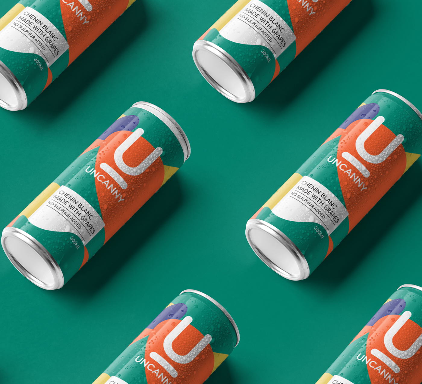
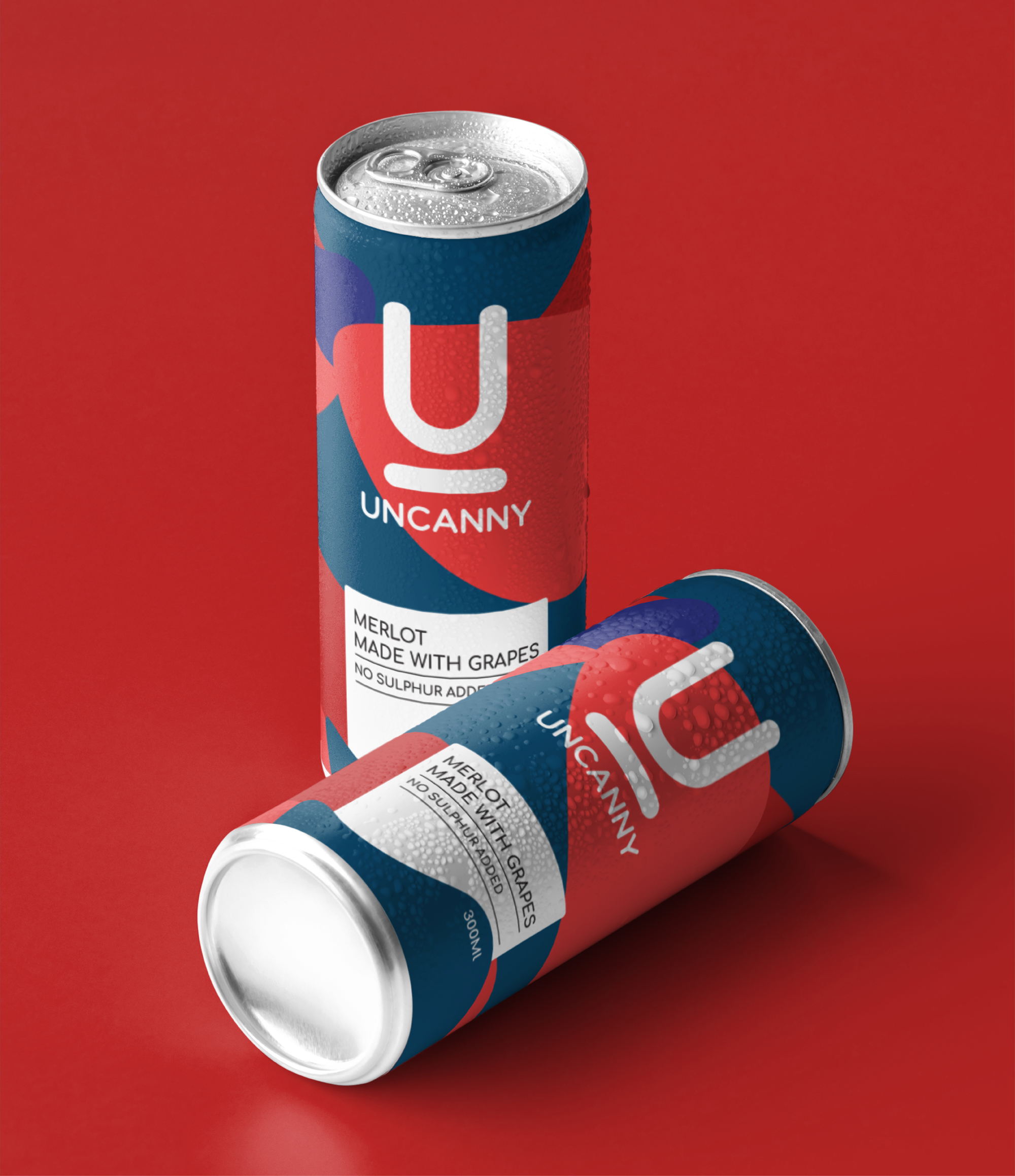
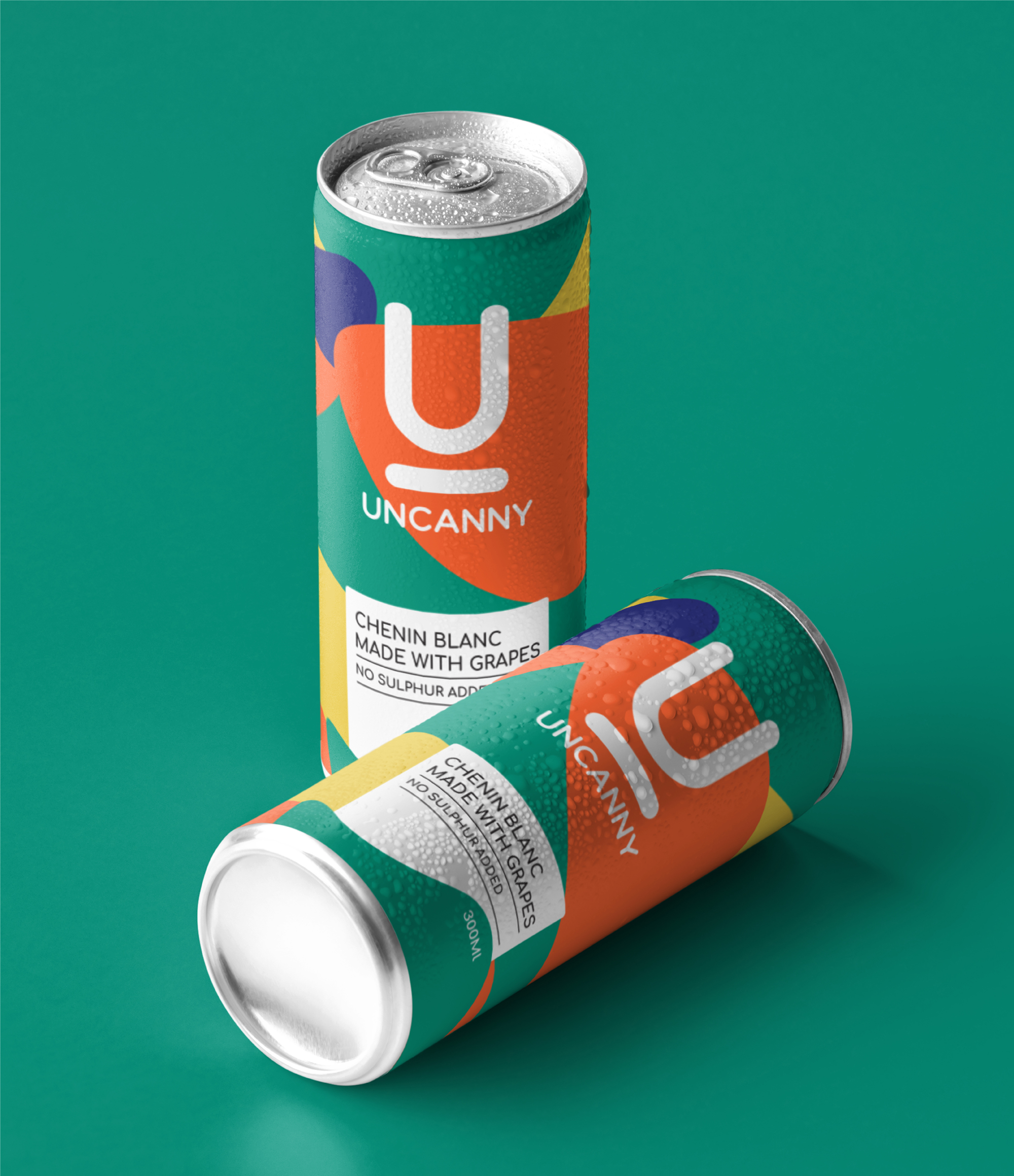
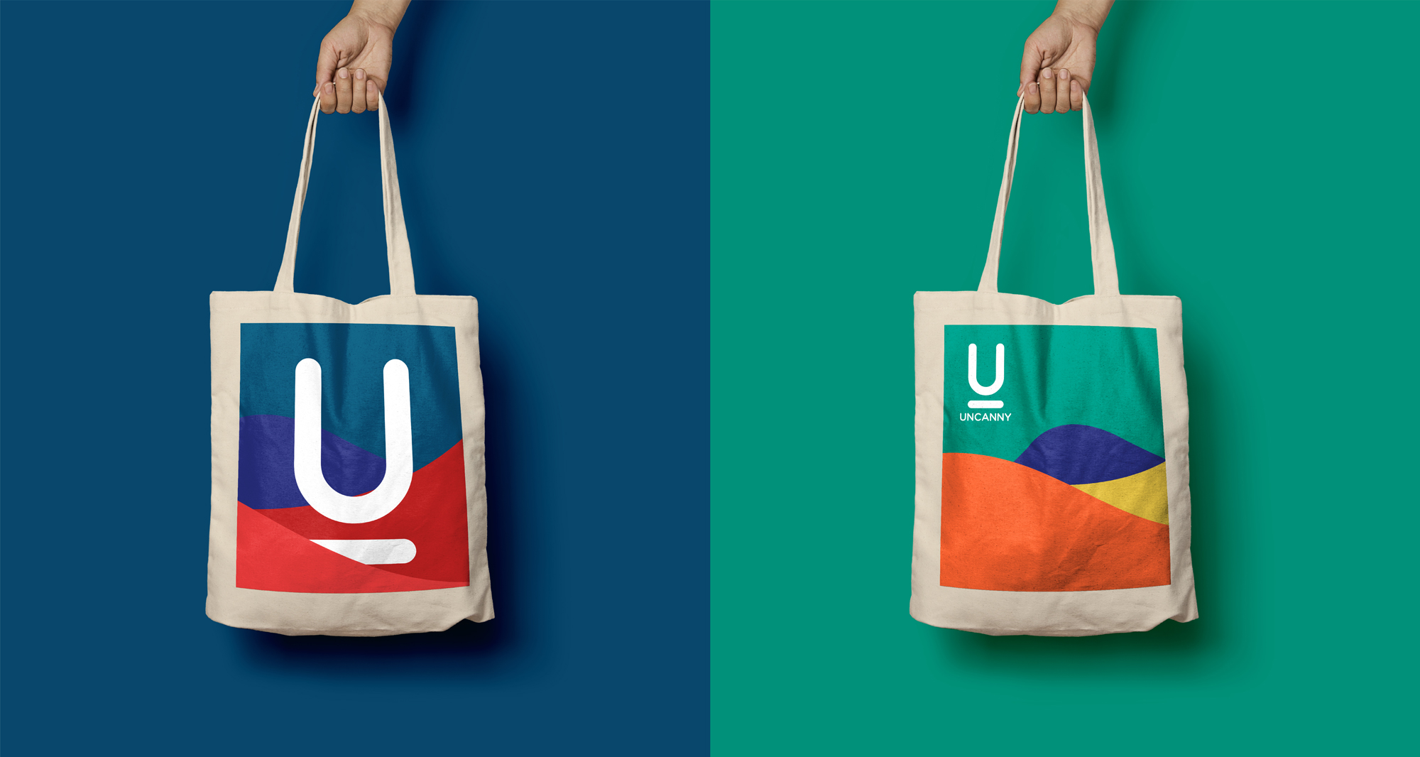
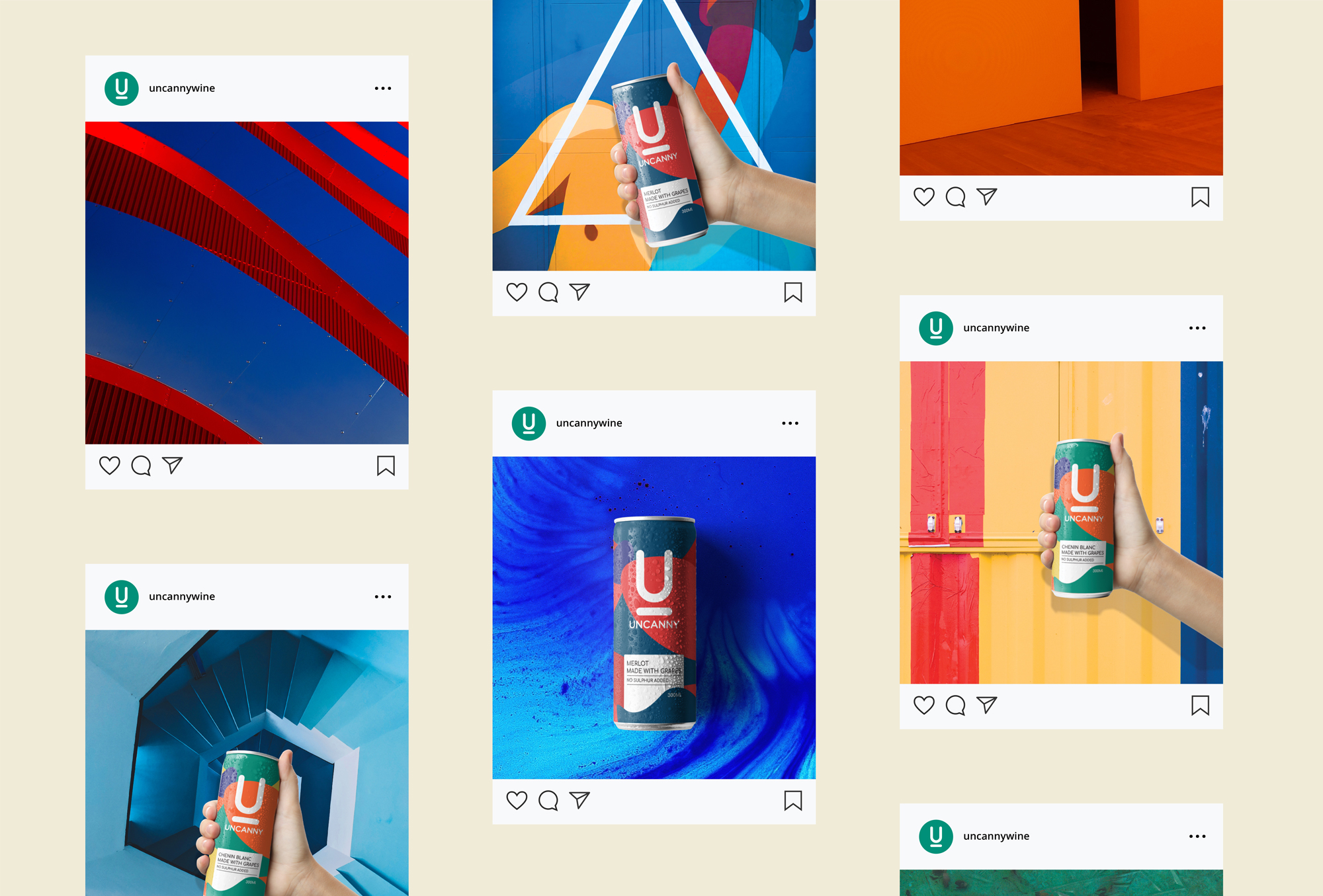
The solution A harmonious pattern inspired by natural landscapes, paired with bold and memorable colours. The ‘U’ logo, reminiscent of a can pull tab, became the distinctive mark of Uncanny.
Contribution Art Direction, Packaging, Branding, Ideation, Illustration